Optimizing Instagram Feeds
Case study on potential feature for Instagram’s mobile app which would allow users to create their own feeds with selected accounts.
Product Designer
Feb- Apr 2022
Individual Case Study
Challenge: Giving Users More Control Over What They See
Instagram allows users to easily share content, connect with others, and explore their interests. As a busy college student, I usually find myself scrolling through my feed to see what my friends are up to and to unwind. I sat in bed after a long day of classes doing just this, but felt rather flooded by an unorganized sea of posts. I came to this hypothesis:
Instagram helps people feel connected to their friends, family, and interests, but many users feel like their feed is unorganized and overwhelming.
91%
Usbaility
4.8*
User Satisfaction
Do Other Users Feel the Same Way?
The Regular
The Content Creator
The Non-Regular

Uses the app to engage with others and interests
Uses the app for business purposes
Does not use the app frequently
A Change in My Hypothesis
Upon several interviews, I found that in addition to users feeling like their feed is overwhelming, many feel unfulfilled random or monotonous content.
I then revised my people problem: Instagram helps people feel connected to their friends, family, and interests, but many users feel like they’re wasting time on unfulfilling content because their feed feels random or monotonous.
How can we give users more control over what they see?
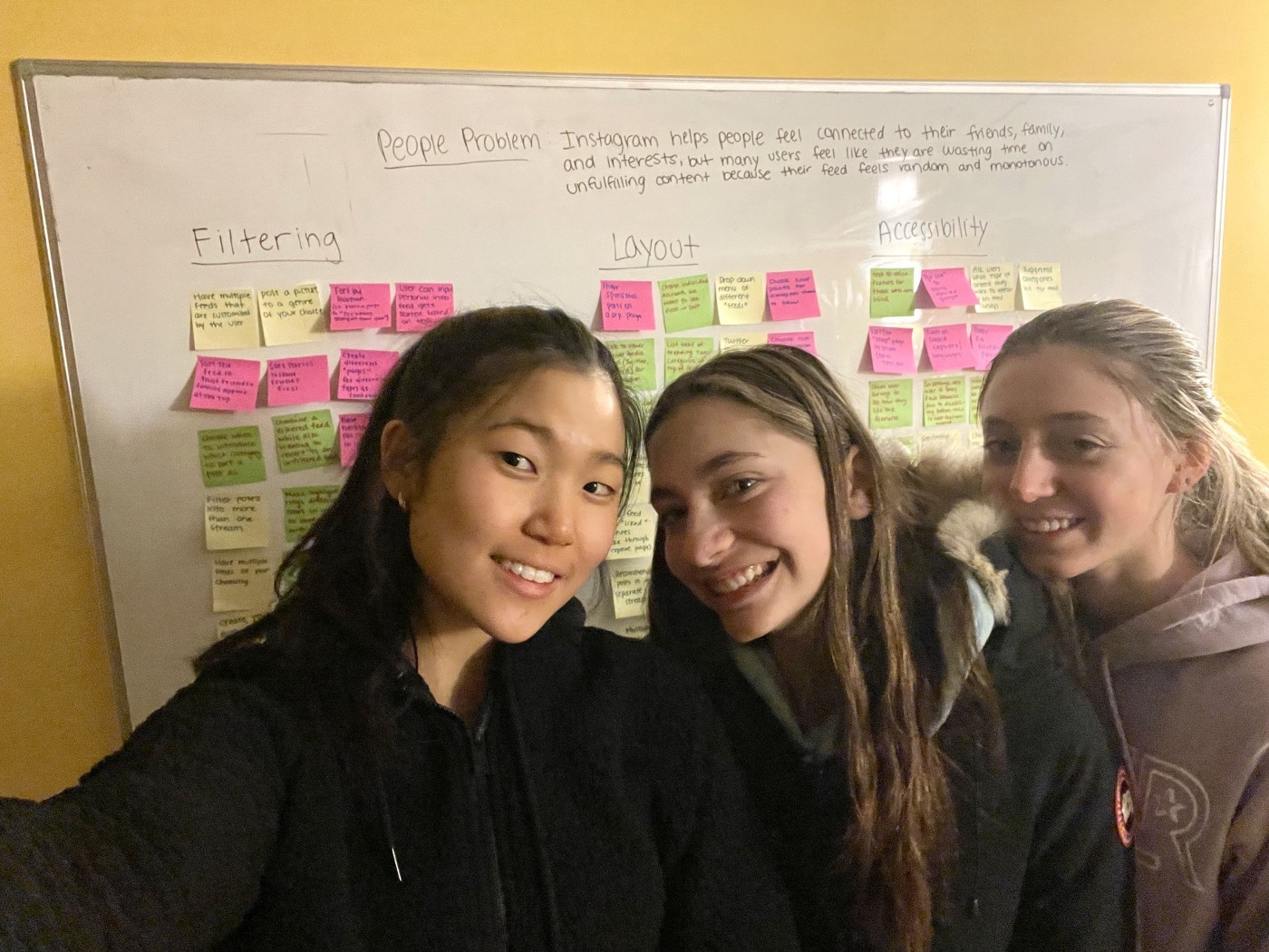
I texted two of my friends to join me for a collaborative brainstorming session: Camryn Scott, a business major, and Sammy Relles, an artist. With a whiteboard, three packs of Post-Its, and three sharpies, we came up with three solution spaces to my hypothesized problem:
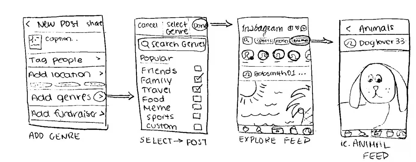
(1) Posting to a Genre: Before posting, users could add their post to genres of their choice. Other users could view these posts under their respective category.
❌ Too similar to Instagram hashtags
❌ Gives control to the user who is posting rather than the user who is viewing
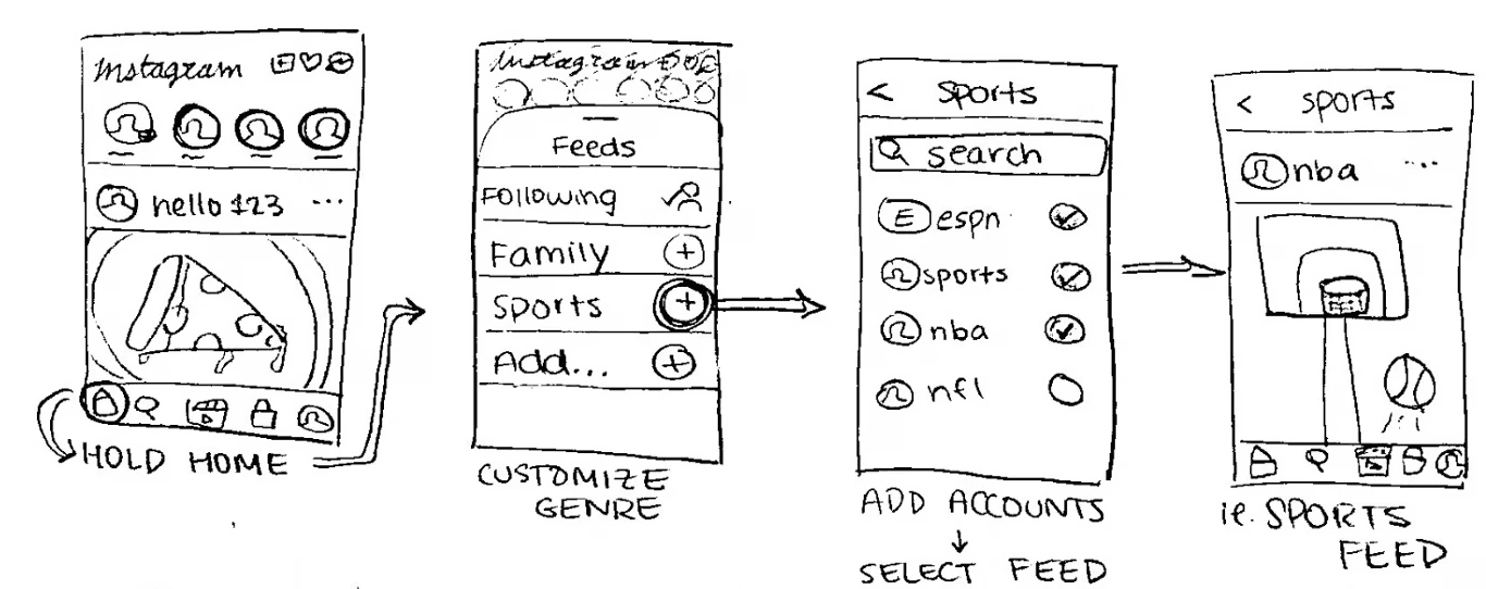
(2) Customized Feeds: Users could create their own categorized feeds with accounts of their choice. A menu of feeds would consist of the default feed and the user’s customized feeds.
✅ Gives full control to viewer over what content they want to see
✅ Most feasible and effective
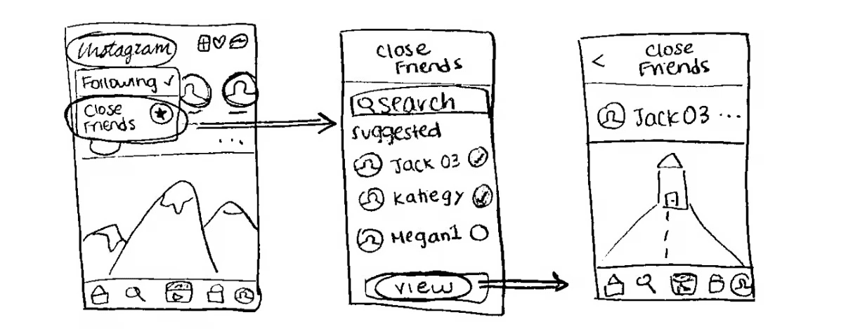
(3)“Close Friends” for Posts: Users could have a feed with just posts from users on their “Close Friends” list. They could switch between their default feed and their “Close Friends” feed.
❌ Doesn’t fully get rid of “random content”
❌ Only filters out one category of accounts
Where Would This Feature Fit?
Inspiration
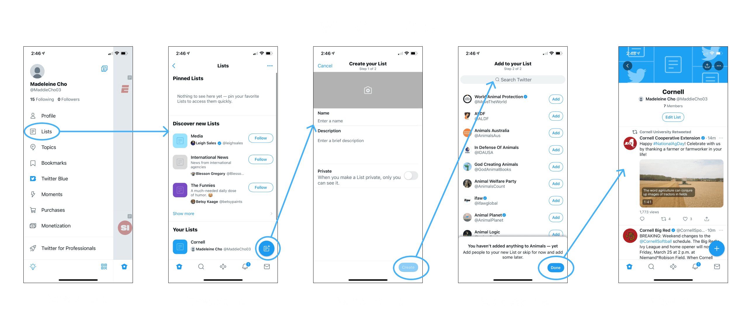
To gain inspiration for my feature, I looked to Twitter’s “Lists” feature which tackles the problem that I found in my user interviews. This feature allows users to filter their feed into customized groups of accounts.
A. Pop-up Menu
✅ Similar to current IG features (switching between accounts)
✅ Easy to access, not too many new screens
❌ “Delete feed” is too prominent; users might click this instead of “Done”
❌ Pencil icon to name feed is awkward
B. New Button
✅ Organized; clear entry point
✅ “Done", “Delete feed”, and "Name Feed" buttons are better located
❌ More steps needed to use feature; many new screens
❌ Not as intuitive; new button on home screen
A Bump in the Road
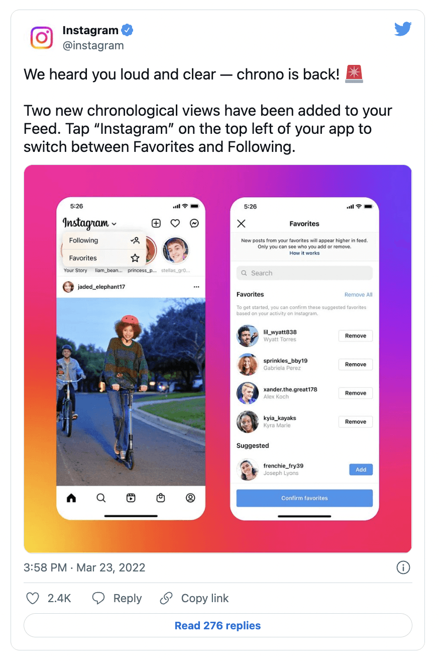
At this point in my project, Instagram launched a new feature. At first I panicked — I was worried that this feature would be too similar to my idea and I considered pivoting from my idea. However, taking a step back, I realized that this news actually validated my people problem: People want more choice and control over what they see in their feed.
The new features give users quick access to what they’re most interested in. My feature would do just that, and more. Users would have even more control over what they want to see at any given moment. So, I decided to stick with my idea and develop my own take on how Customized Feeds could work.
C. Drop-down Menu
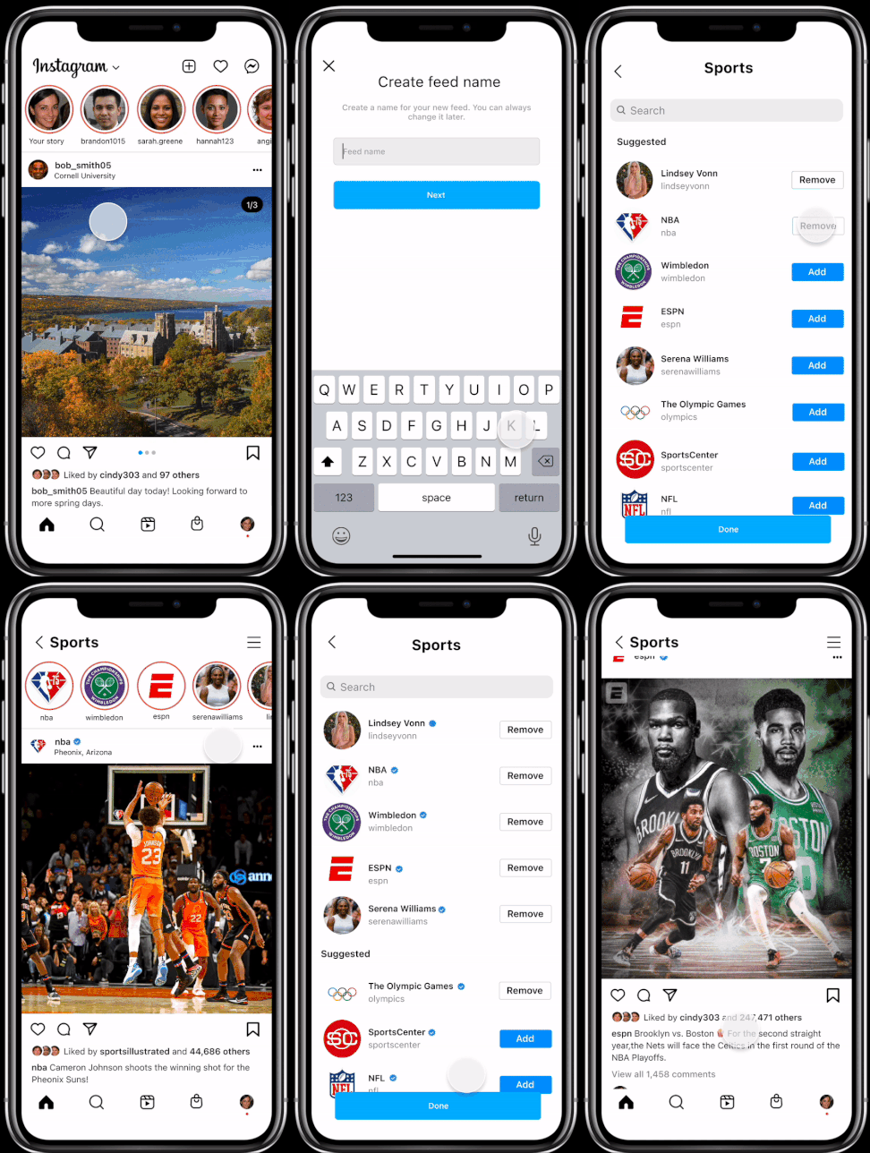
I took inspiration from the update and created a new mockup. Rather than having a pop-up menu appear from the home button or a new icon, I built off of the new drop-down menu below the Instagram logo to fit into its current design system. For the rest of the flow, I used the layout of Exploration B, which has separate pages to create a feed name and edit a feed. This approach is more organized and allows for more intuitive buttons and editing options.
✅ Intuitive; fits into IG’s current design system
✅ “Done", “Delete feed”, and "Name Feed" buttons are better located
❌ Too similar to how IG looks now
User Testing
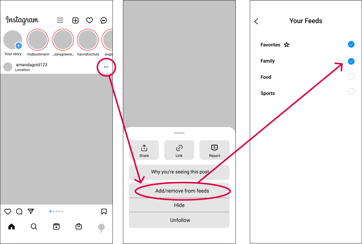
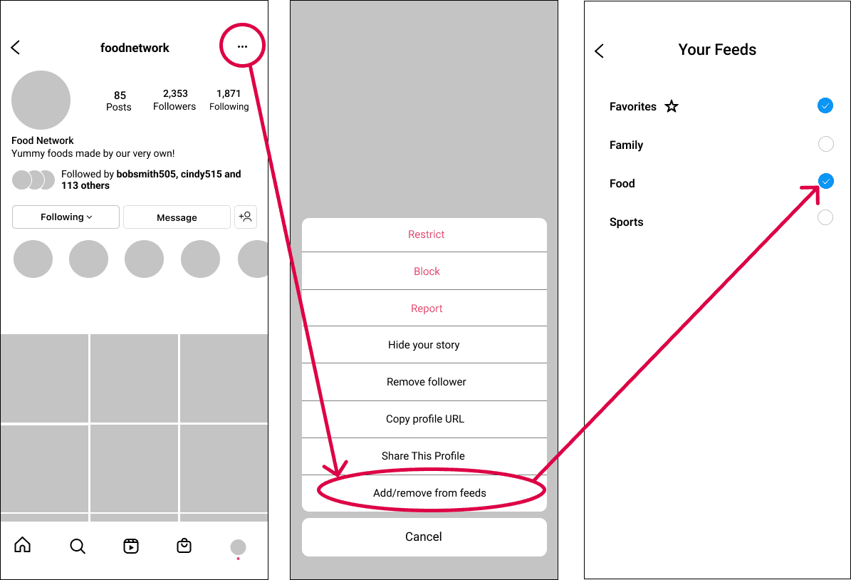
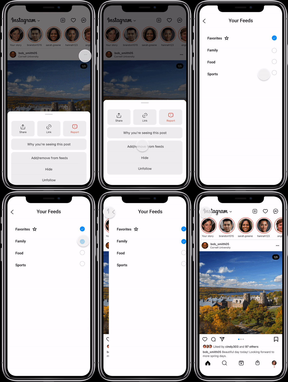
After testing these three explorations on a handful of users, I decided to stick with Exploration C. I then explored a few more flows. To add more access points to my feature, I decided to add entry points from a user’s post and profile.
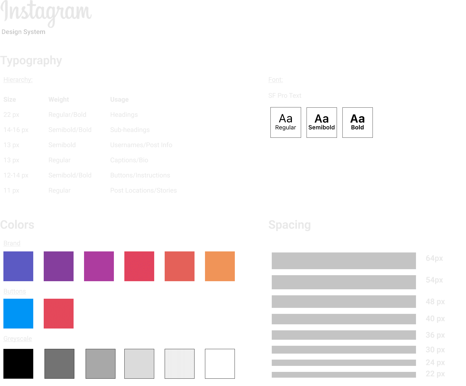
UI Kit
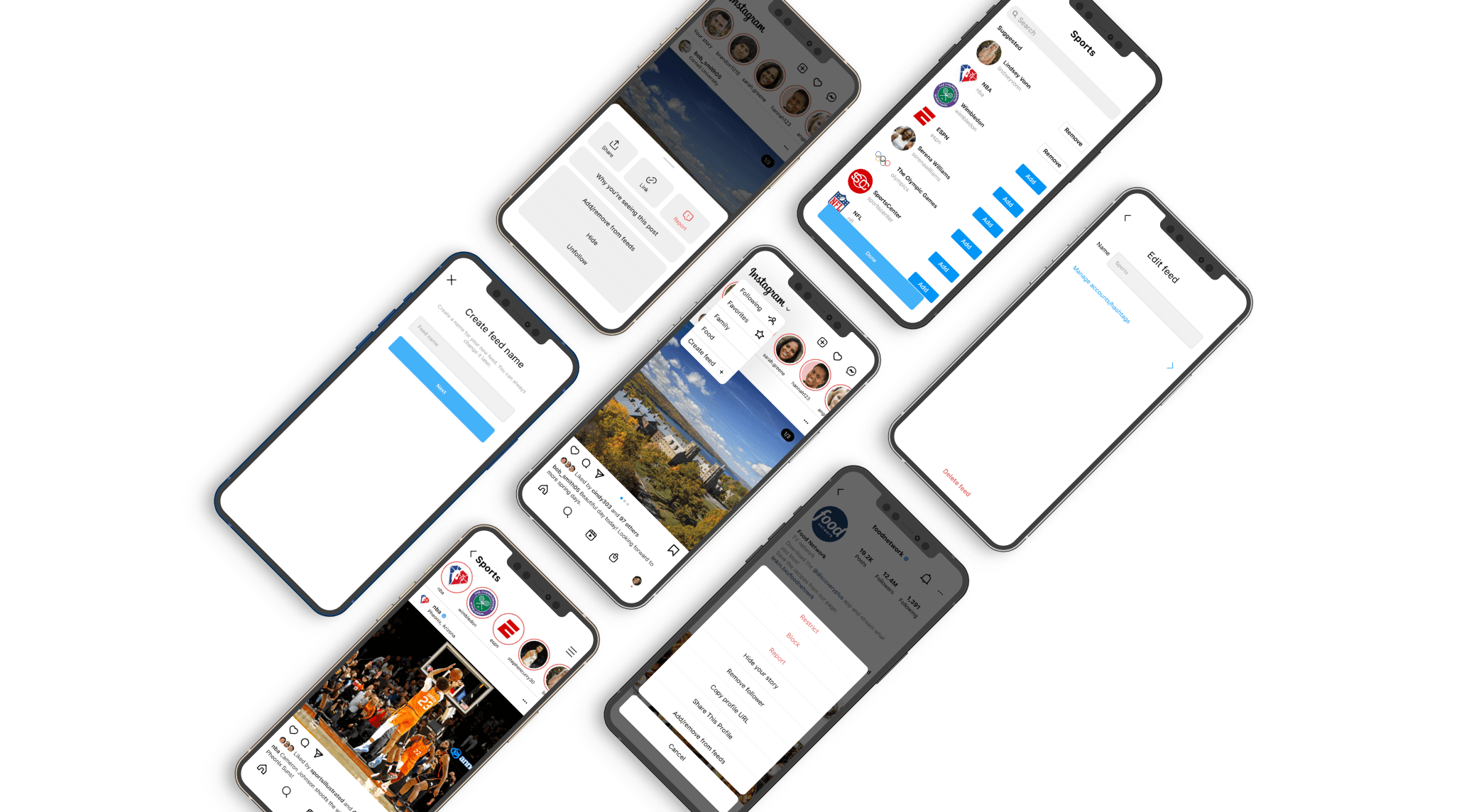
Final Solution
Conclusion
Instagram is one of the most popular social media apps. It helps millions of users connect with people and interests around the globe. However, some users feel unfulfilled and overwhelmed by the content that appears on their feed. Hopefully this Customized Feeds feature can help users be more intentional with the content they view and minimize the clutter on their feed, giving them more choice and control over what they see.
This project was my first full-length UX case study and I couldn’t have had more fun working on it. Through constantly telling my friends and family about this project, I realized how passionate I am about product design. Every step of the process had me excited and on my toes. One huge takeaway that I leave with from this case study is that design is not a linear process. Initially, it was intimidating to face constant change and iteration but I learned to always keep an open mind!
*This is a case study for a project in Intro to Digital Product Design. I am in no way affiliated with Instagram*
