Case Study · PwC · Software & Product Innovation · 2025–2026
Designing the human layer of an
enterprise AI ecosystem
300,000+ employees had powerful AI tools but no way to orient inside them. I designed the systems that turned a fragmented AI landscape into something people could navigate, trust, and act on.
The problem
The tools worked. Orientation didn't.
The firm had invested heavily in AI. But the experience was a sprawl of disconnected surfaces, and client-facing employees couldn't answer basic questions: What's the state of my work? Who do I know at this client? What needs my attention right now? The information existed. It just lived in a dozen unconnected places.
Why it was hard
Complexity on every axis
Fragmented data sources
Relationship, pipeline, and engagement data lived in separate systems that had never been designed to talk to each other.
Conflicting user contexts
A partner, a manager, and a first-year analyst needed completely different things from the same surface, with different levels of AI familiarity.
Trust and compliance constraints
Surfacing relationship and client data meant every design decision had to account for confidentiality, access rules, and what the AI was allowed to infer.
Shifting requirements
This was a live AI platform built alongside Microsoft. Capabilities and constraints changed underneath the design throughout.
The decision
Stop surfacing every capability equally. Design the system around what someone is trying to do right now, and let relevance — not completeness — drive the interface.
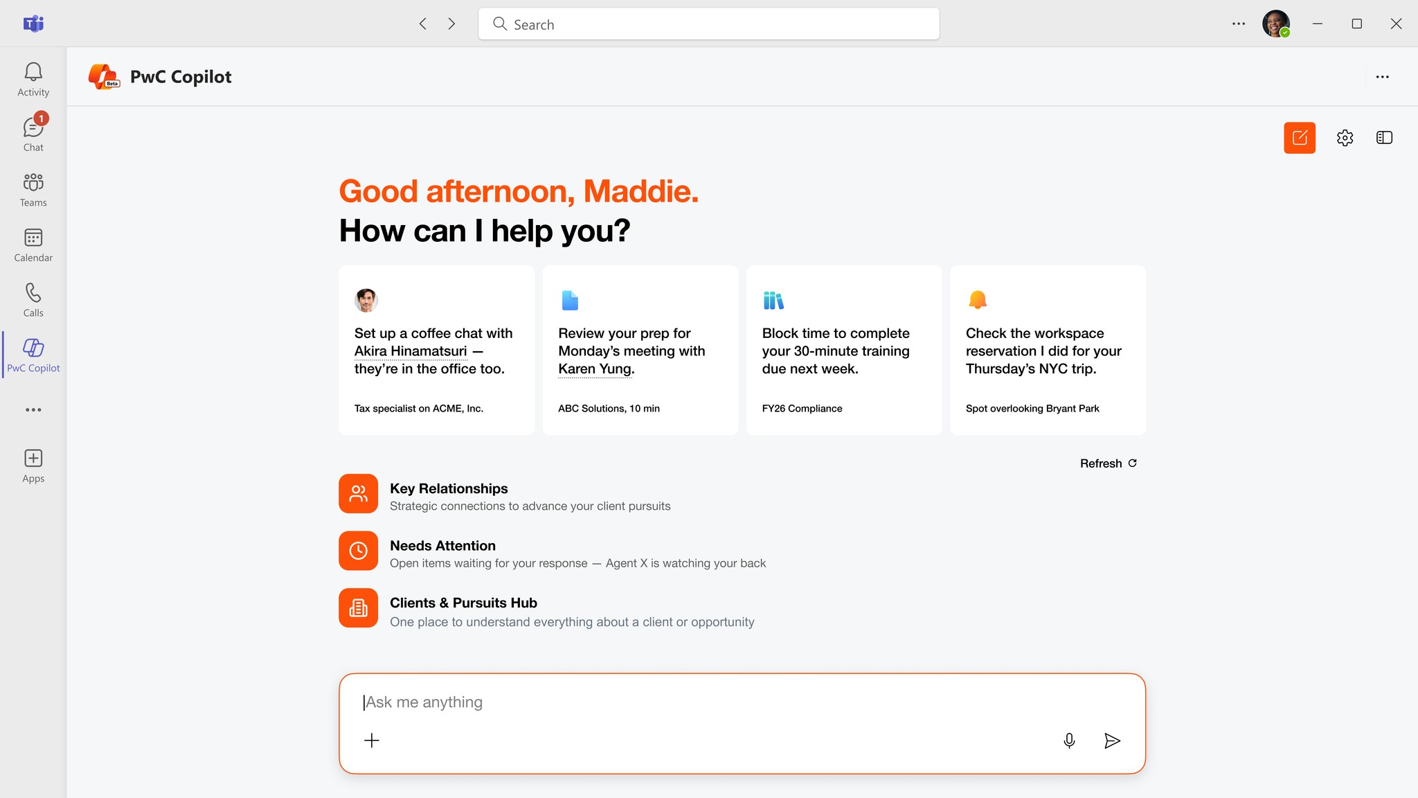
What I designed
Three surfaces, one connected system
Each surface solved a different orientation problem, but they shared one information architecture so the system felt like one product, not three features.
Key Relationships
Turns scattered relationship data into a navigable graph: who matters to a pursuit, how strong the connection is, and the warmest path to an intro. The design challenge was ranking — deciding what signal meant "relevant" without overwhelming the user or exposing data they shouldn't see.

Needs Attention
A prioritization surface that triages what's slipping — follow-ups, stale threads, time-sensitive work — with urgency signals and AI-generated context. The hard part was trust: an AI that flags the wrong thing trains people to ignore it, so the ranking had to be conservative and explainable.

Clients & Pursuits Hub
Consolidates active pursuits, deal values, and pipeline status from fragmented systems into one view. This was the information-architecture core of the project: deciding what belonged on a single surface versus what would bury the signal under detail.

Tradeoffs
What I chose not to build
Conservative AI ranking over comprehensive coverage
A surface that flags fewer things accurately builds more trust than one that surfaces everything and is occasionally wrong.
Embedded relevance over a full AI tool catalog
People didn't want to browse capabilities. They wanted the right one to appear in the context of the work they were already doing.
Shared IA over per-feature optimization
Each surface could have been individually richer, but a consistent system made the whole thing learnable.
The adoption layer
AI Tool Guide
Designing features was only half the problem. Adoption stalled because people didn't know what AI tools existed or which were approved for their work. I designed and shipped a discovery platform that filters tools by task, surfaces personalized recommendations, and tracks usage — then ran 8 usability sessions and iterated between each one.

What testing changed
Relevance beat completeness
Reorganized tools around task and role context instead of a firm-wide catalog.
Use cases made tools real
Added concrete 'best for' examples from real engagements; abstract descriptions didn't drive exploration.
Guidance was getting lost
7 of 8 participants missed the guidance tab. Pulled task-based framing up to the top level.
"Filling the gap in how people can find and navigate all that exists in the AI space — which is very difficult. That's probably the most value I see out of it."
— Senior Manager, Assurance
Outcome
What shipped
300K+
Employees with access to the shipped surfaces
3
Connected surfaces shipped into PwC Copilot
8/8
Usability sessions completed across 4 lines of service
Reflection
What this taught me about AI systems
Designing for AI trust is a different problem than designing for usability. These surfaces weren't hard to make functional — they were hard to make trustworthy. When an AI surfaces the wrong thing, people stop trusting the whole system, so restraint in what the AI claimed became a core design constraint.
If I went back, I'd push for longitudinal testing over weeks rather than snapshot sessions. Trust in an AI surface reveals itself over time, not in a single sitting — and that's the metric I'd most want to design against next.