Introducing MedExplain (PALS)
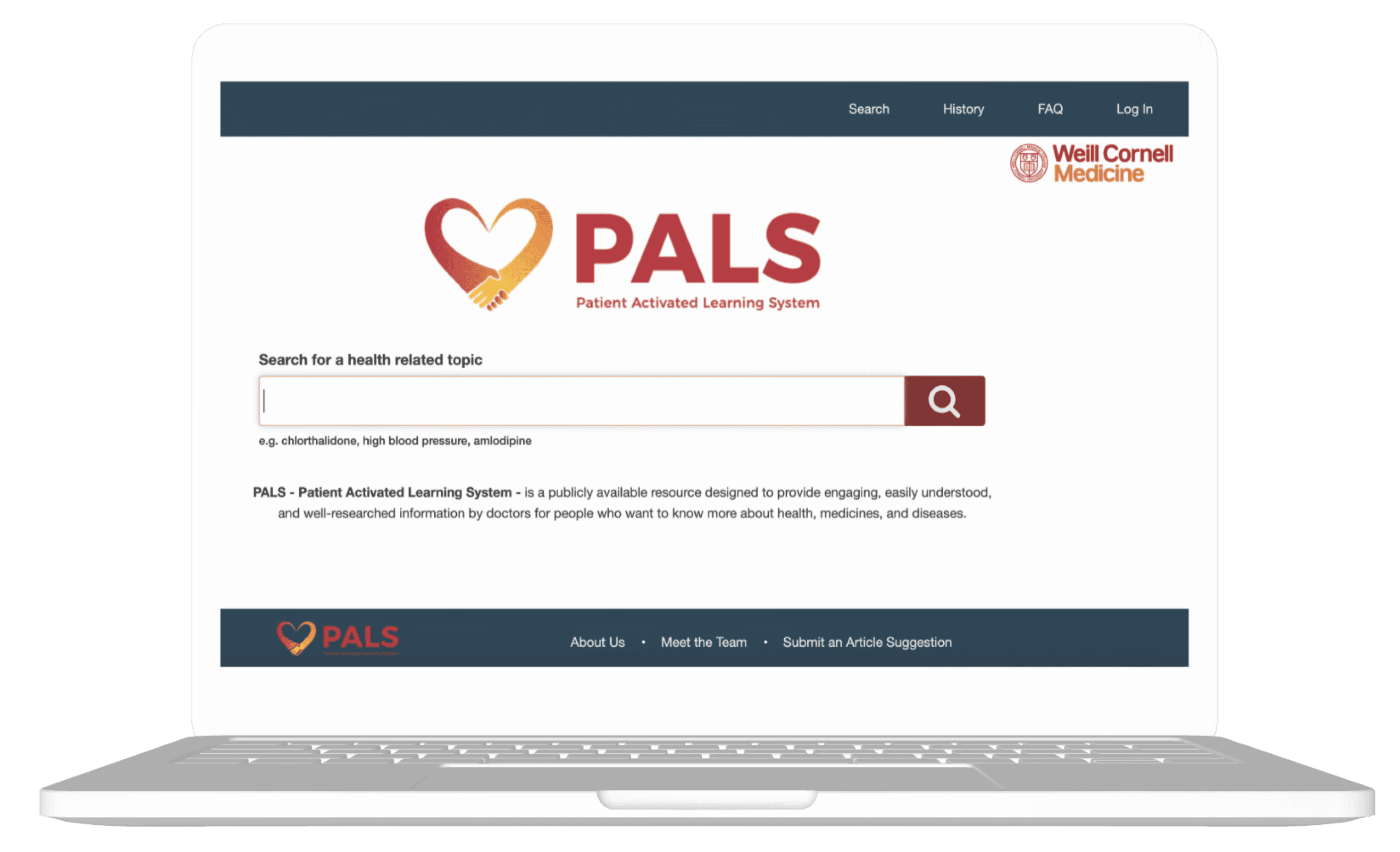
MedExplain’s Patient Activated Learning System is a web platform, backed by Weill Cornell Medicine, that enables individuals to obtain health-related information sourced from real medical research.
MedExplain’s Patient Activated Learning System is a web platform, backed by Weill Cornell Medicine, that enables individuals to obtain health-related information sourced from real medical research.
How could we add value? We looked at 5 competitors and found:
How could we add value? We looked at 4 competitors and found:
Strengths
✅ Diverse articles
✅ Professional sources
✅ Simple yet functional
✅ Clean interfaces
How could we add value? We looked at 4 competitors and found:
Weaknesses
❌ Distracting advertisements
❌ Cluttered layout
❌ Complicated terminology
❌ Overly broad search results
How could we add value? We looked at 4 competitors and found:
Based on this, we decided to center our design-thinking around balancing professionalism with diverse content, highlighting credibility in direct ways, and providing information that is easy to digest.
How do others feel about navigating online medical information?
We conducted both interviews and surveys to further understand how users gather medical information. Four themes emerged from affinity mapping our research findings:
We prioritized organization the product feel credible and navigable.
How do others feel about navigating online medical information?
We prioritized organization the product feel credible and navigable.
How do others feel about navigating online medical information?
Balancing clean and welcoming visuals to create consistent branding.
Ideation: We prioritized making the product feel credible and navigable.
Balancing clean and welcoming visuals to create consistent branding.
We combined the strongest aspects of each iteration to create a strong, collective vision.
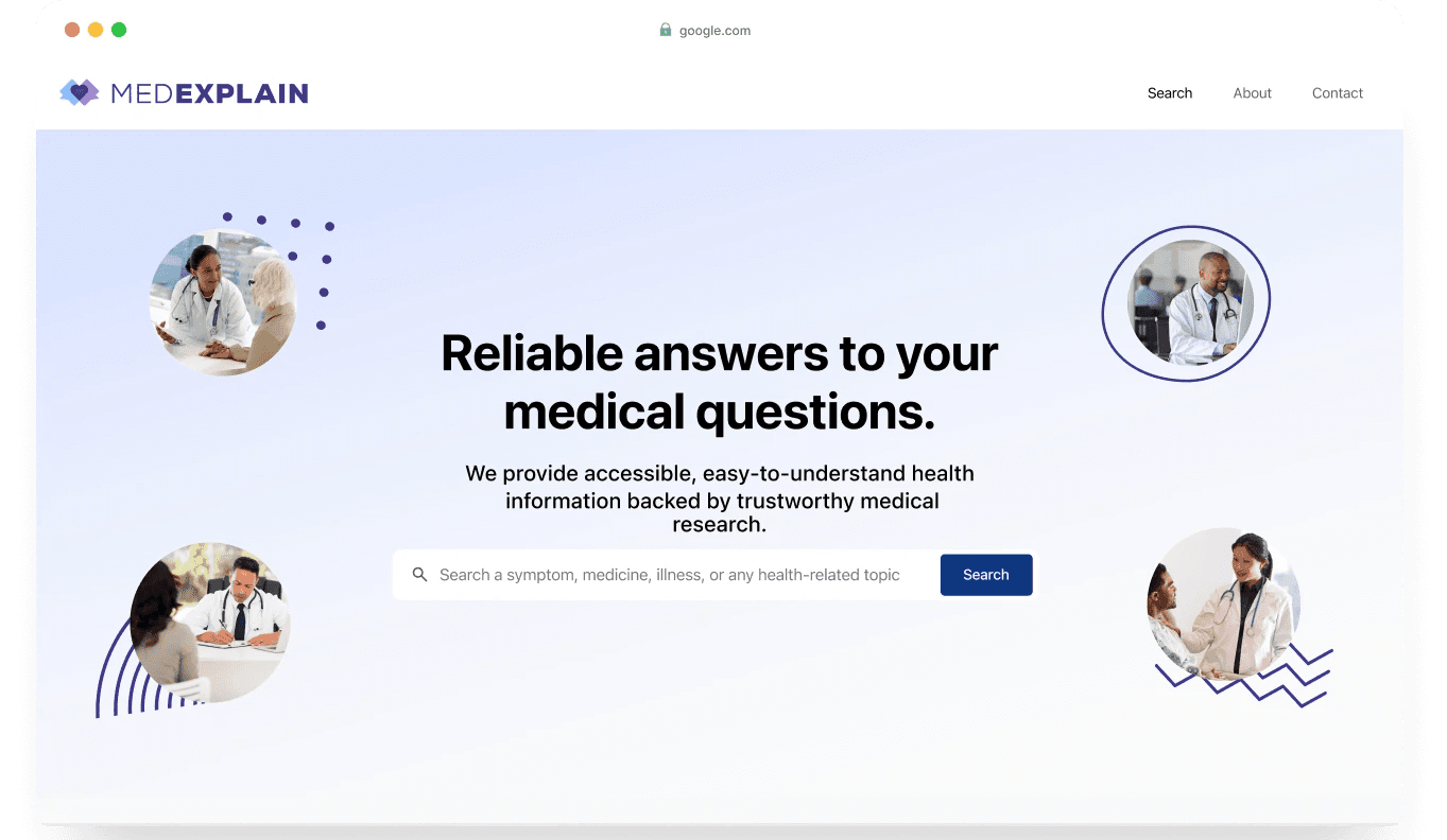
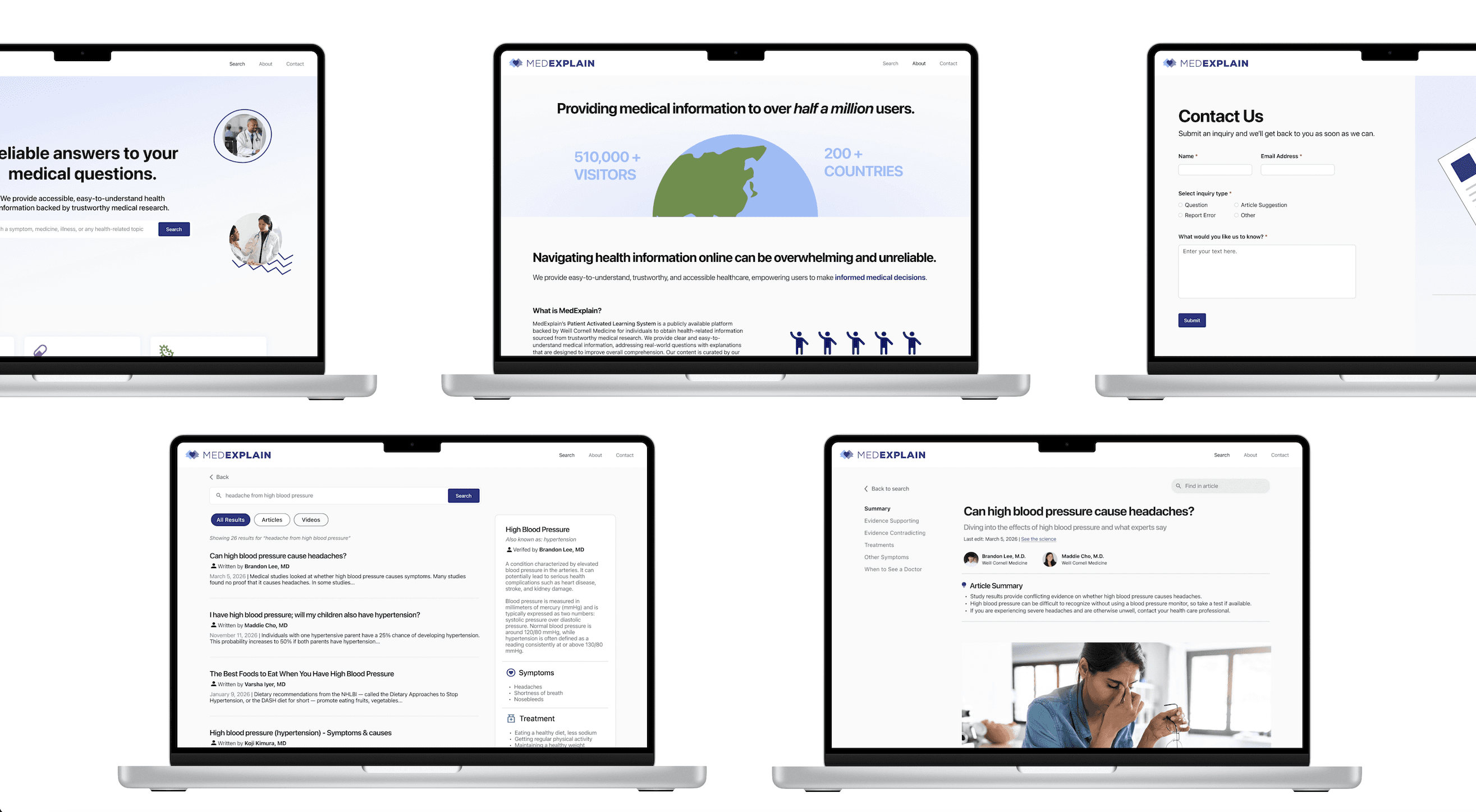
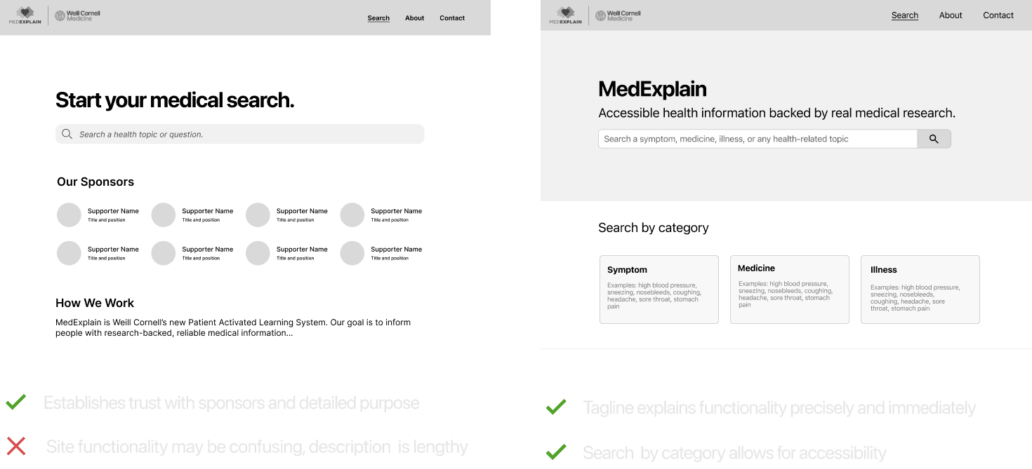
In our landing page, we established a clear and immediate purpose and a strong CTA in the search bar.
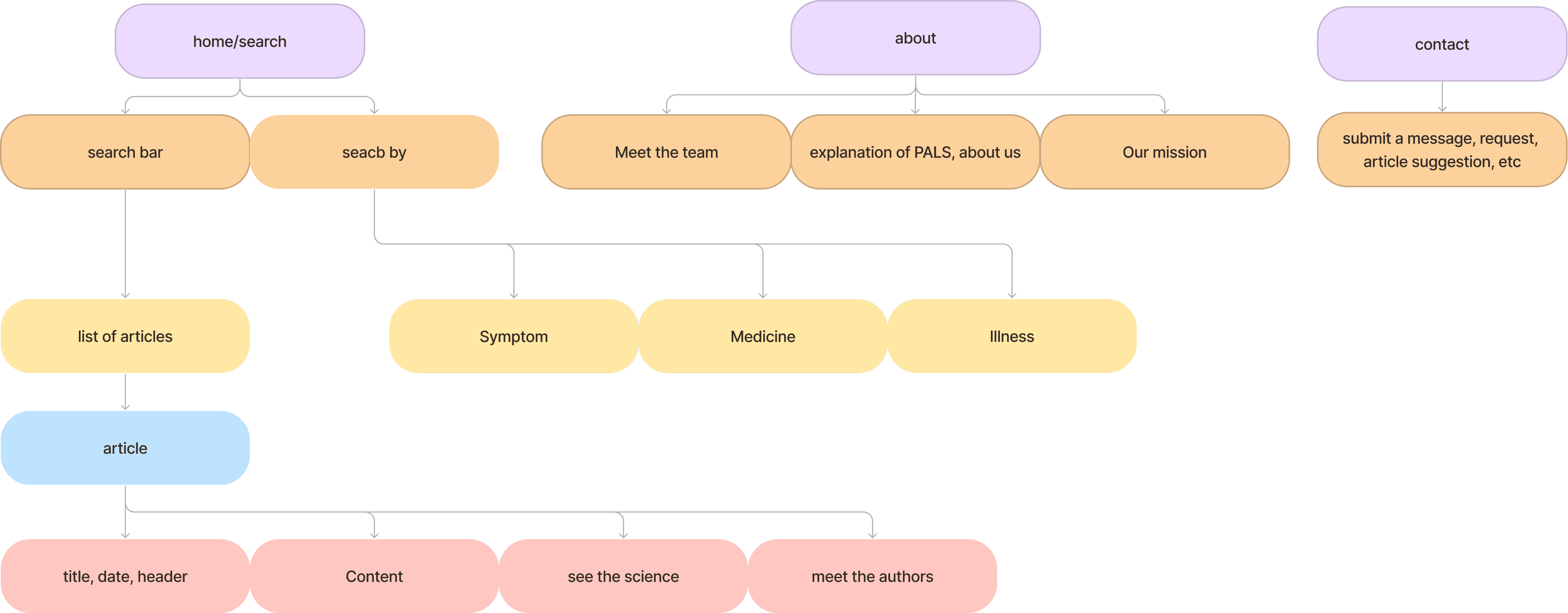
Users can also search by the most popular categories, discovered in our research survey.
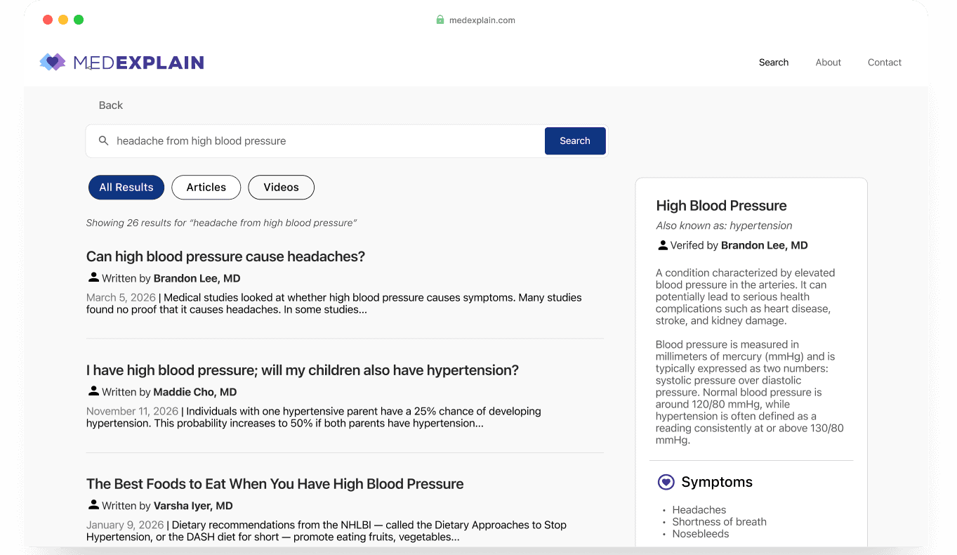
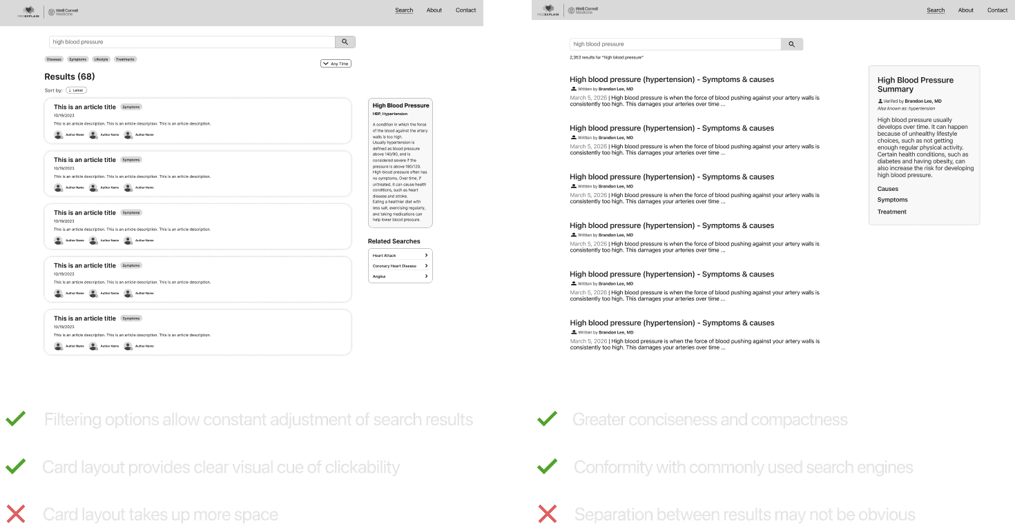
After entering a search, users are prompted with a concise summary verified by a reliable doctor.
The results page also includes an accessible filter for different types of media.
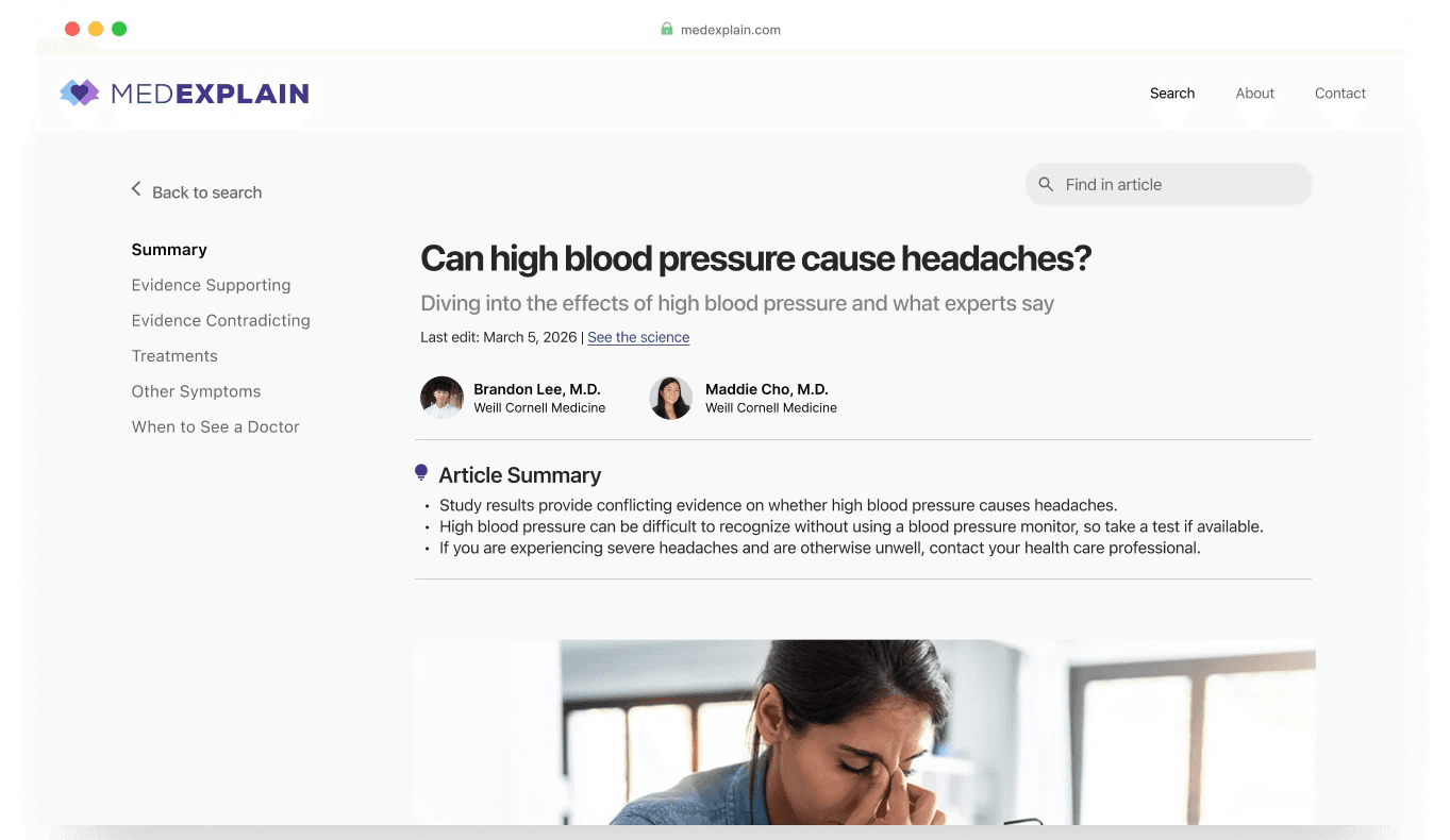
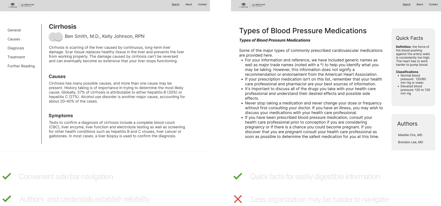
We included an easy navigation bar on the side that users can click to skip to different sections in the article.
The authors’ credentials are clearly displayed which users can click to view a modal with more information.
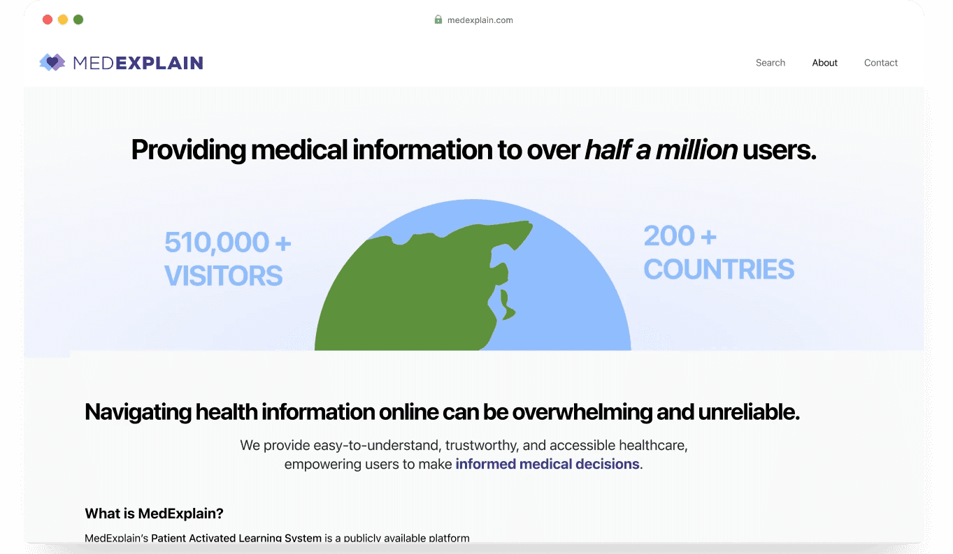
Our about page states MedExplain’s purpose directly and immediately. Statistics and testimonials back up our impact.
We also included the MedExplain team and ongoing research to show the company’s continuous growth.
User Testing
After conducting usability testing and gathering internal feedback, we found that there was confusion about our searching by symptoms functionality. We decided to add an explanation of the symptoms search as well as a more accessible and visible search bar.
Additionally, users wanted more visual branding cohesion in our About page. In response, we changed the color scheme of the visuals and added a line of direct purpose.
Prototypes
Looking forward
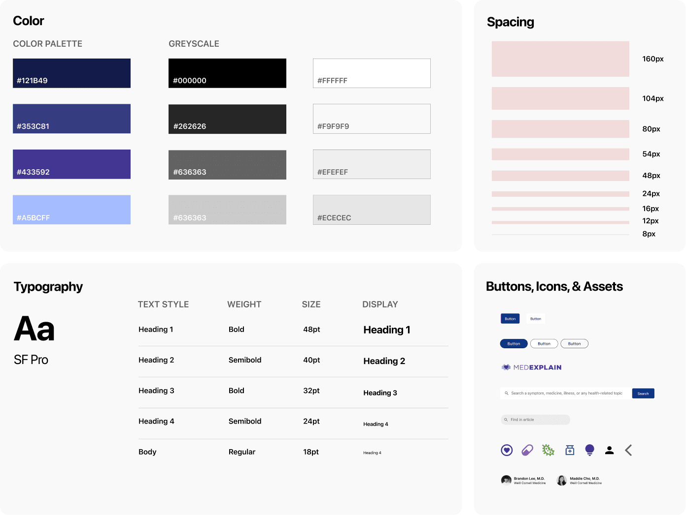
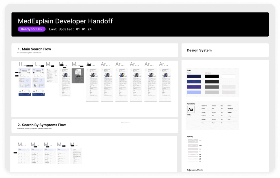
Before closing the book on this project, we documented our designs for MedExplain’s developers.
We also conducted a second round of testing on 25 individuals to measure increased engagement and satisfaction.
On average, participants rated MedExplain’s new platform based on helpfulness and trustworthiness 4.02 out of 5, which is 37.8% higher than existing competitors and 44.8% higher than the original MedExplain platform.
Tackling this real-world problem was challenging yet rewarding.
Despite being confronted with the challenge of designing for an ambiguous target user group, we aligned our team through a singular persona that enabled us to leverage storytelling to empathize with our users.
This project was an invaluable experience for us to learn about challenges in the healthcare space and how to design for accessibility. In just 4 months, we took on the challenge of evaluating the online medical information space, learning what users value in their search experience, and crafting visuals and interactions that solve a real-world problem!
